Nectar app
2018 — Present
Personalised offers you simply can refuse — in the hands of millions of collectors across the UK.
Intro
In late 2017 Sainsbury's successfully trialled a new highly personalised loyalty app 'Rewards Trial' in select stores throughout UK. The app used a bespoke algorithm to surface highly personalised digital offers.
In 2018 they aquired the Nectar business from Aimia as part of an ambitious loyalty, data and insights strategy. This included an existing Nectar app that was packed full of partner offers (think BP, eBay, Ford) but lacked any meaningful personalisation.
We were briefed to merge the two products into a single, Nectar branded app — combining the very best of Nectar in an incredibly ambitious timeframe. We adpoted a design sprint methodology, pioneered new standards of inclusive design and maintained an intensive customer focus despite significant business pressures.
From a technical point of the view the undertaking was perhaps even more challenging — merging cutting-edge technology with sprawling legacy systems.
In October 2019 together with a brand refresh, the app was launched to select parts of the UK and months later, nationwide — landing in the No.1 spot on the AppStore.
Sainsbury's Rewards Trial web app
Goals (pre-launch)
Together with a large number of senior stakeholders we set clear goals for the new app:
Combine two apps into one within a set timeframe
Apply the new Nectar branding
Aleviate or remove as many known customer pain points as possible
Create the most inclusive app within the group business
Positive customer feedback
Process
We worked together with two contract designers previously employed by Nectar (who we welcomed into our Sainsbury's experiece design team) — frequently moving between two offices to meet with seperate stakeholder groups.
The integration of two companies was an added complexity to the project and inbetween designing much of my time was spent building relationships, raising standards and creating a culture of creativity.
Research
We had substantial research and insight from both the Sainsbury's app trial and the existing Nectar app. This included surveys, diary studies, previous customer testing results and various analytics. We were also able to interview stakeholders who had spent a significant time within the loyalty industry.
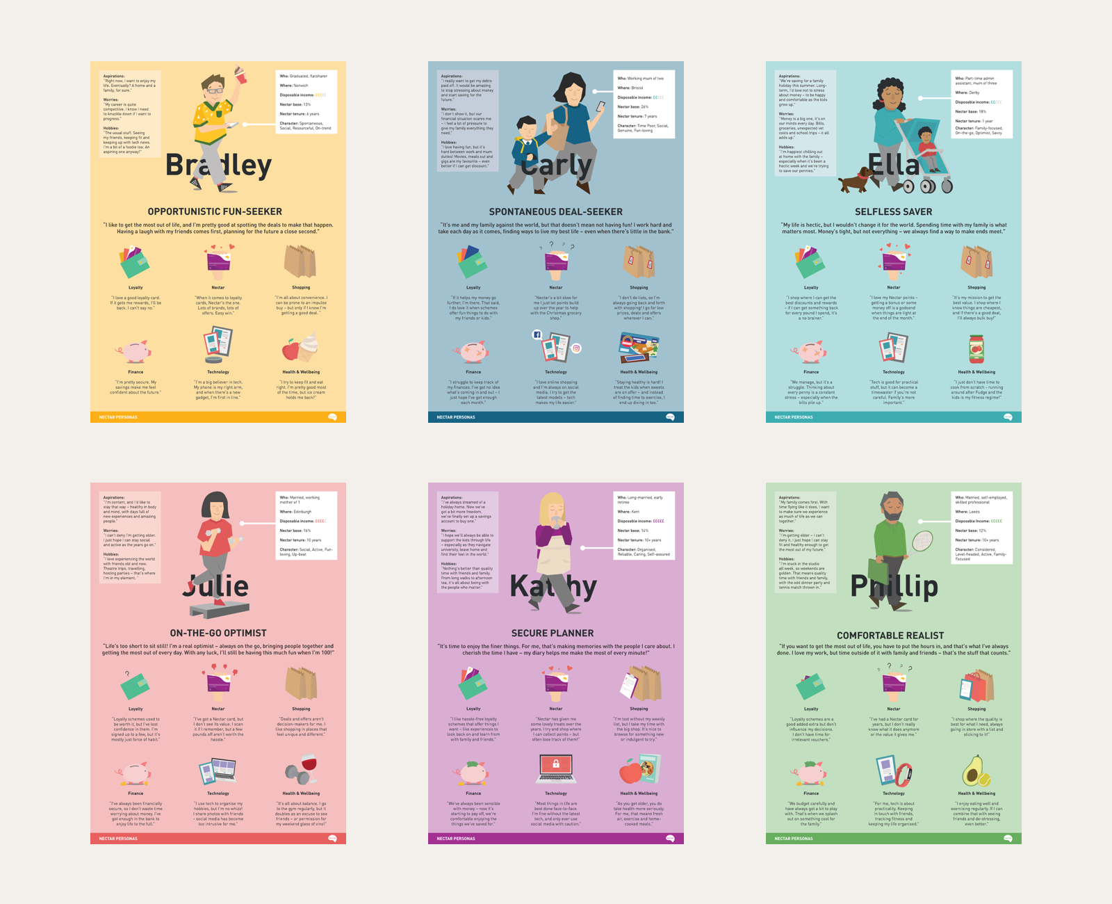
Nectar had commissioned a detailed customer persona project only a year prior — this gave us a good understanding of the potential customer base; their expectations and needs.
Discovery phase
During the discovery phase we immersed ourselves in the Nectar brand, developed ways of working and agreed on principles that would guide our thinking, which was particularly important as we were cross-located.
We also began setting up multiple stakeholder workshops to make sure all requirements were captured and concerns were alleviated. As part of this we identified key themes that would become the epics for our sprints.
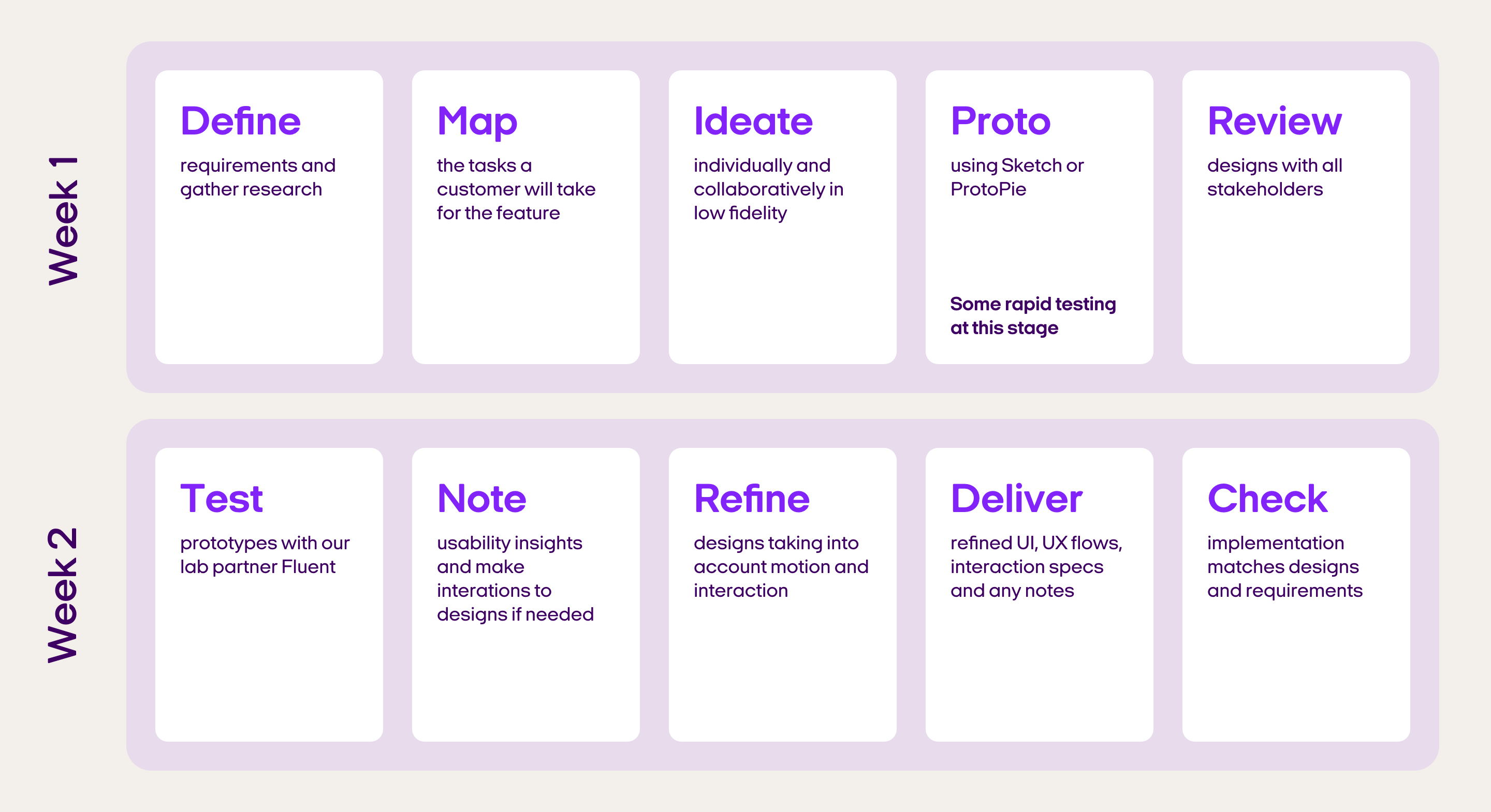
Design sprints
We worked to a plan of 2 week design sprints, utilising both rapid and advanced prototyping. Despite a very tight deadline and our structured approach, we aimed to keep our thinking as wide as possible — designing multiple solutions and variants for every problem in order to maximise innovation.
Process continued
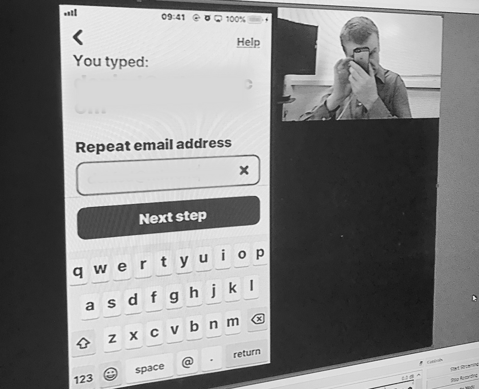
Prototyping and testing
ProtoPie allowed us to work with variables and formulas to create an almost coded feel to our prototypes. We even personalised the prototypes with each participants' name. This gave a strong sense they were using a real app (some even looked for it on the AppStore afterwards) ensuring our insight was as close to reality as possible.
Testing variables in ProtoPie
At the start of every second week, we tested our app with our specialist lab partner Fluent Interaction, using a moderated approach. Fluent weren't an existing partner — we sourced their expertise specifically for this project (and we continue to use them to this day).
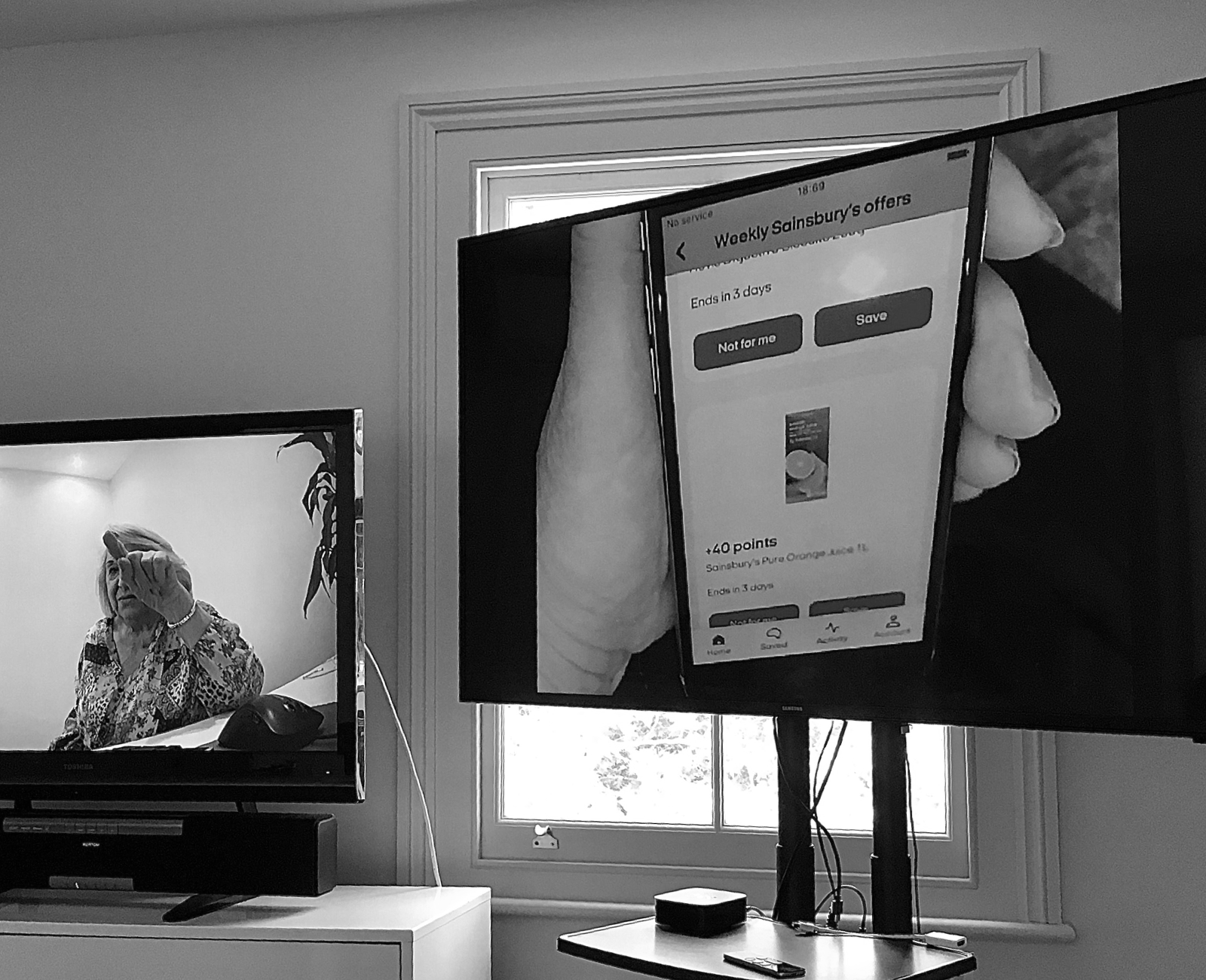
Testing with Fluent Interaction
Accessibility checklist
Inclusivity is at the heart of every decision I make as a designer. When this project began, I made it my mission (and took considerable time) to evangelise this inclusive design thinking across all areas of the business. Thanks to an incredibly commited development team, I'm proud to say we were able to create the most accessible app that Sainsbury's had ever built:
✓ AA or AAA contrast ratio
✓ Fully scalable fonts
✓ System font support
✓ Screen reader support
✓ Option to turn-off animations
Accessibility testing
In collaboration with the accessibility lead, I secured budget for specialist acccessibilty testing in partnership with Open Inclusion. This was a Sainsbury’s first but has now become part of the experience design process for many products across the group.
+30%
of customers use at least one accessibility feature
A partially sighted participant uses the app with 'Larger Text' set to one of the largest settings
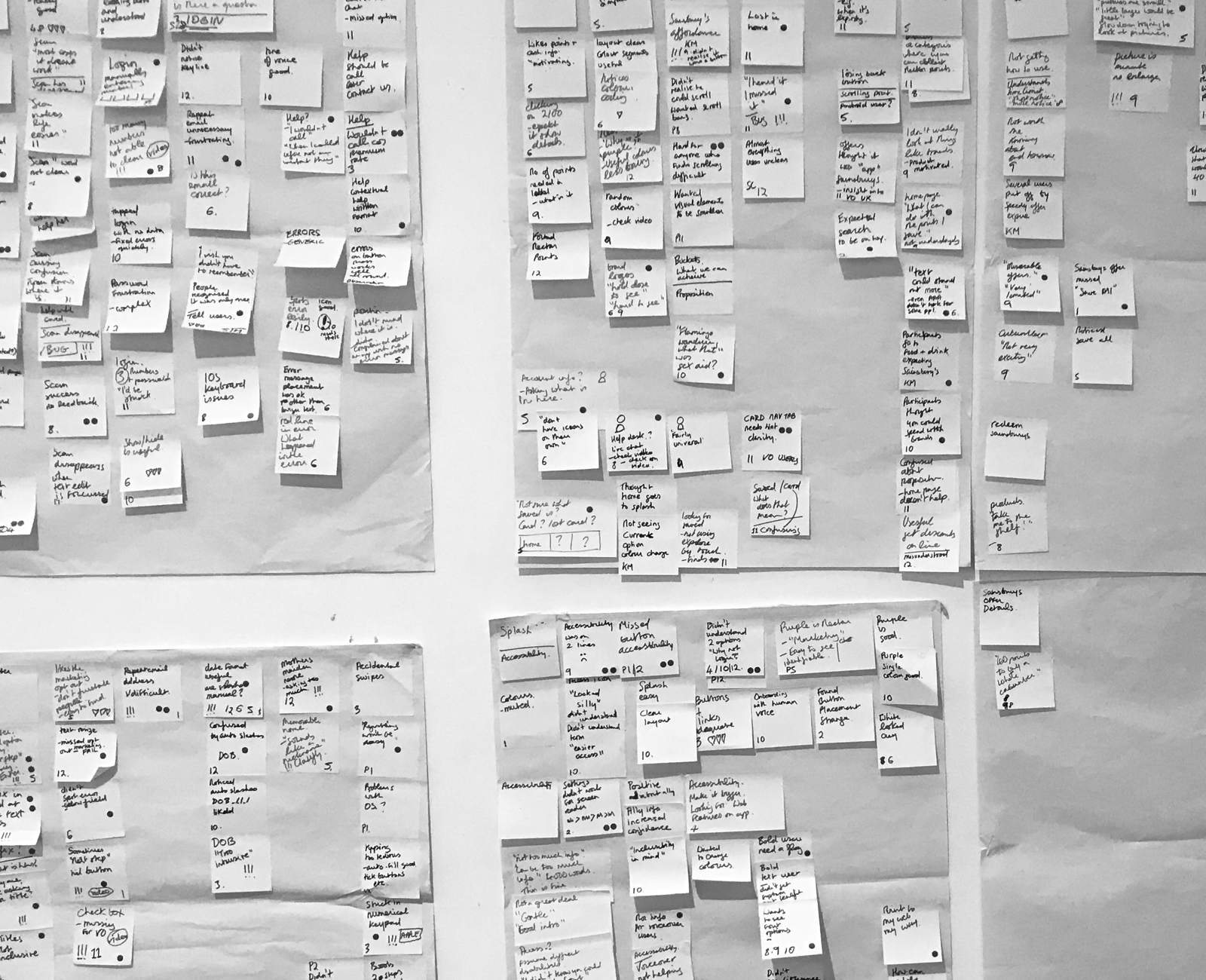
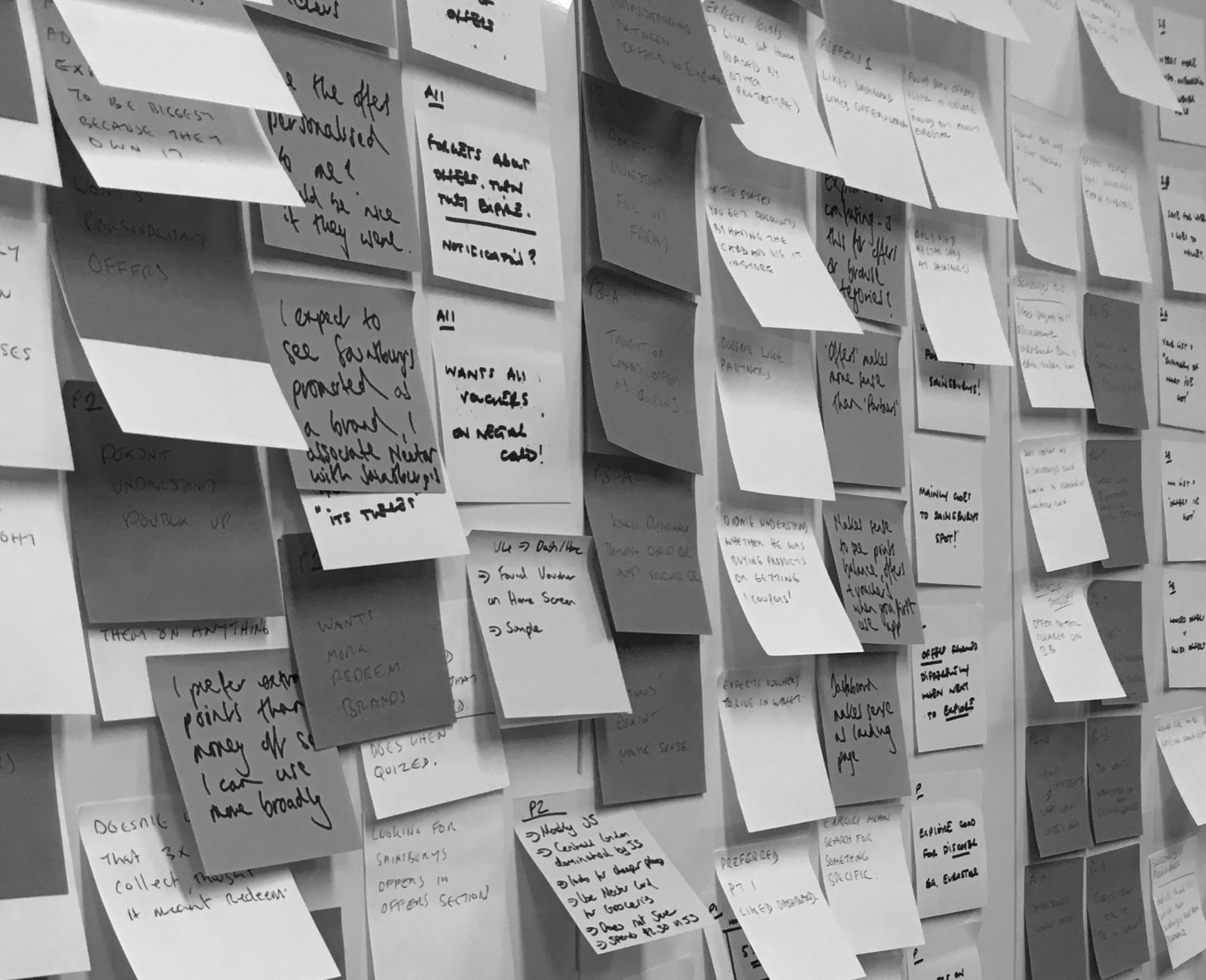
Grouping our notes the day after testing
Design details
The app was (and is) designed to be simple and intuative, with inclusivity and broad appeal front of mind.
The colourful and expressive nature of the Nectar brand was perfect for key moments but too overwhelming for more considered tasks — so we took a dynamic approach:
For the registration process we created a sense of clarity and calm; leading with putty and white and accenting with core purple.
For key moments such as completing tasks, we really emphasised the use of colour; leading with our core purple and following with bright yellow, red and green.
Throughout the experience we introduced customers to our animated expressions — a key part of our brand refresh work.
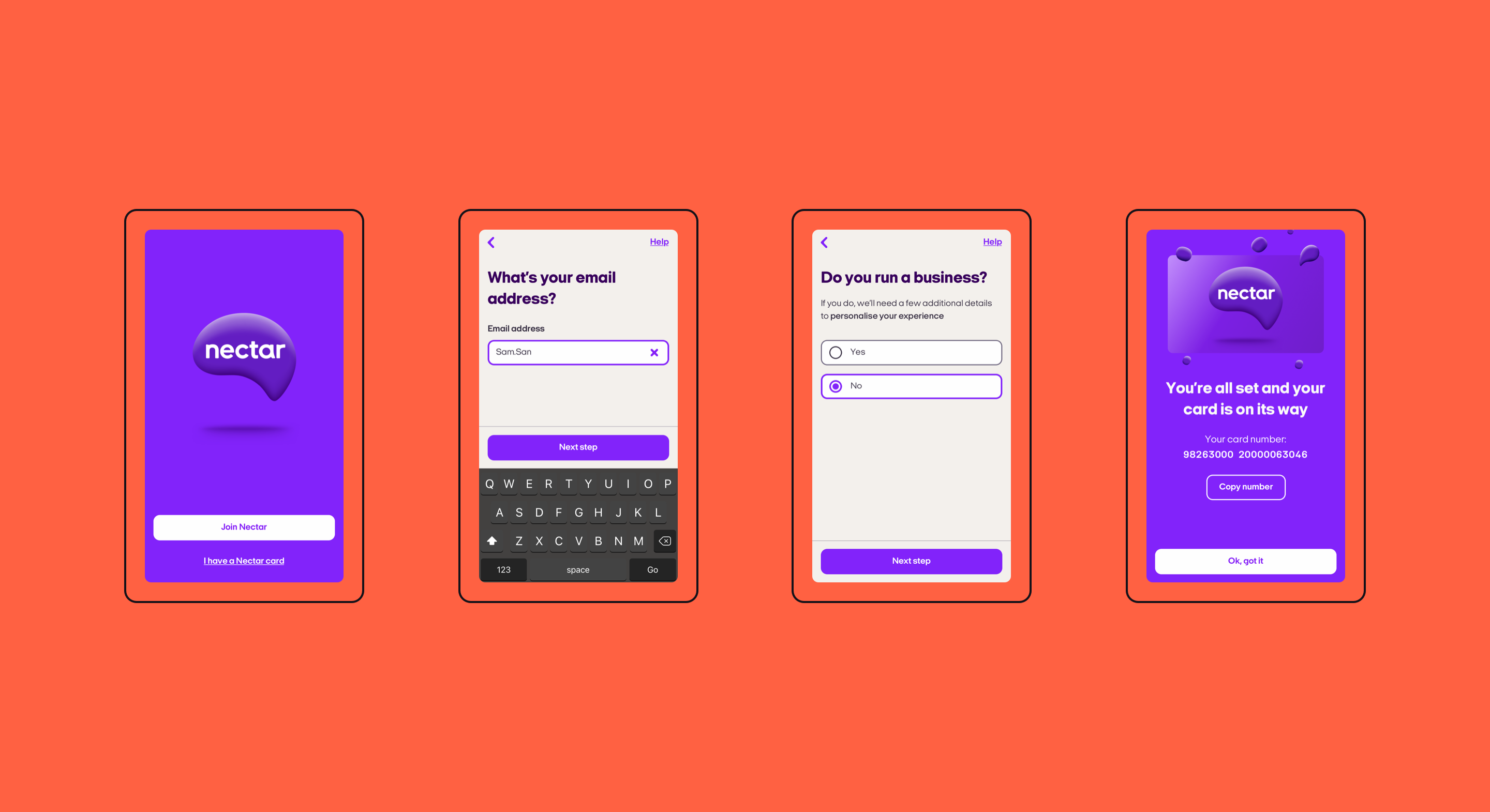
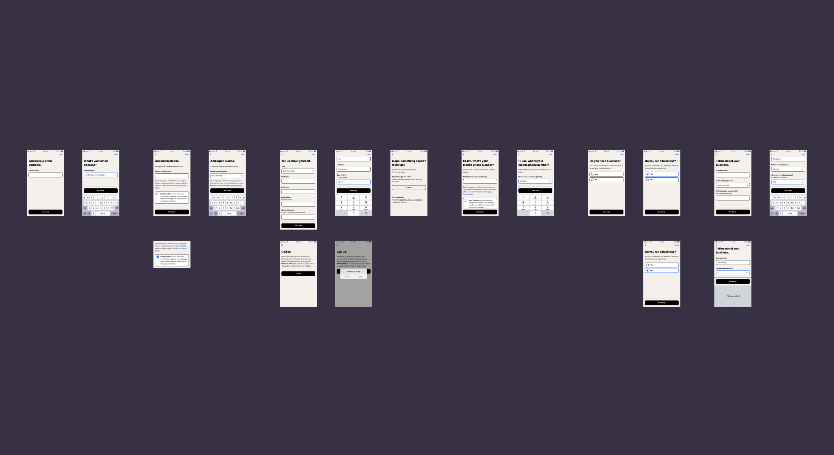
Registration
There's needed to be several steps in the Nectar registration process (legal and data requirements) but instead of having a few really long pages we opted for a bitesize approach.
Totally new customers (never used Nectar before) had to go through around 12 steps and there was no way of shortening this. However, when we tested registration people found it to be generally easy.
We used a friendly conversational tone and simple, informal language.
Access to Live chat and our support telephone number was kept at the top right of every page.
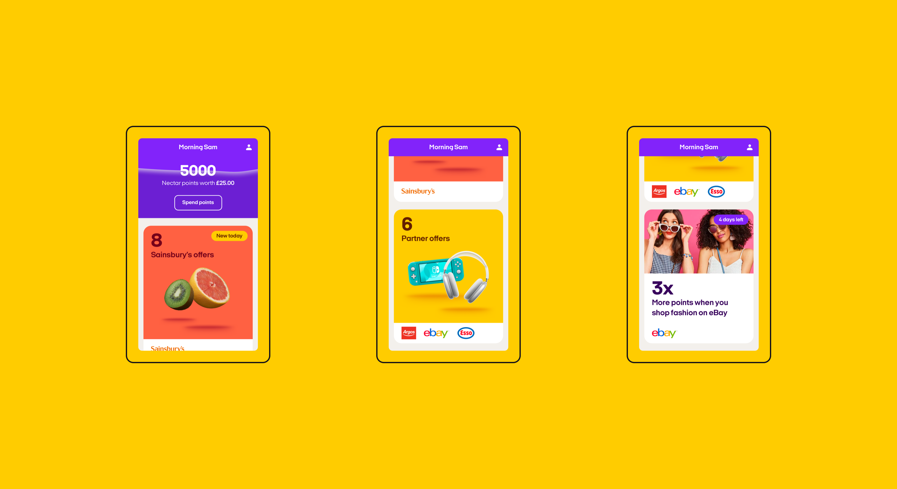
Home
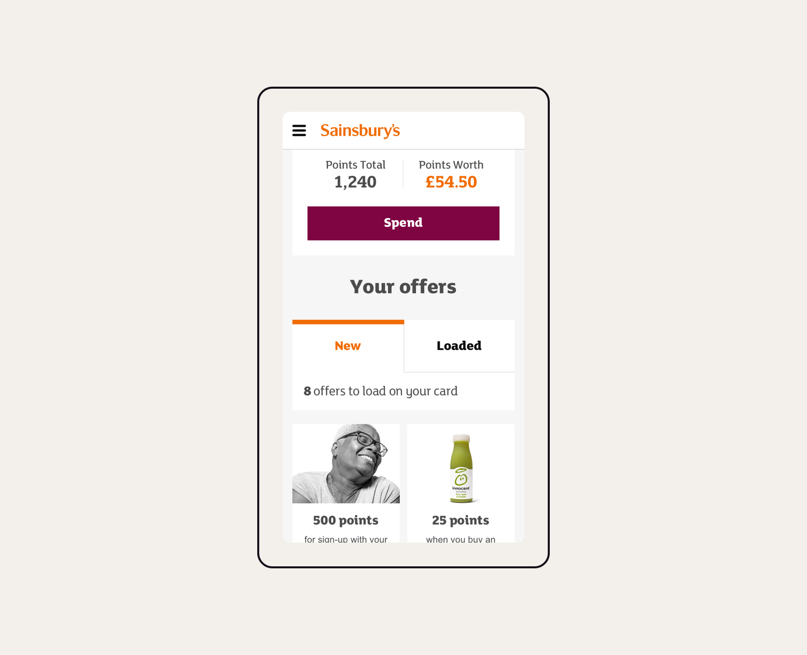
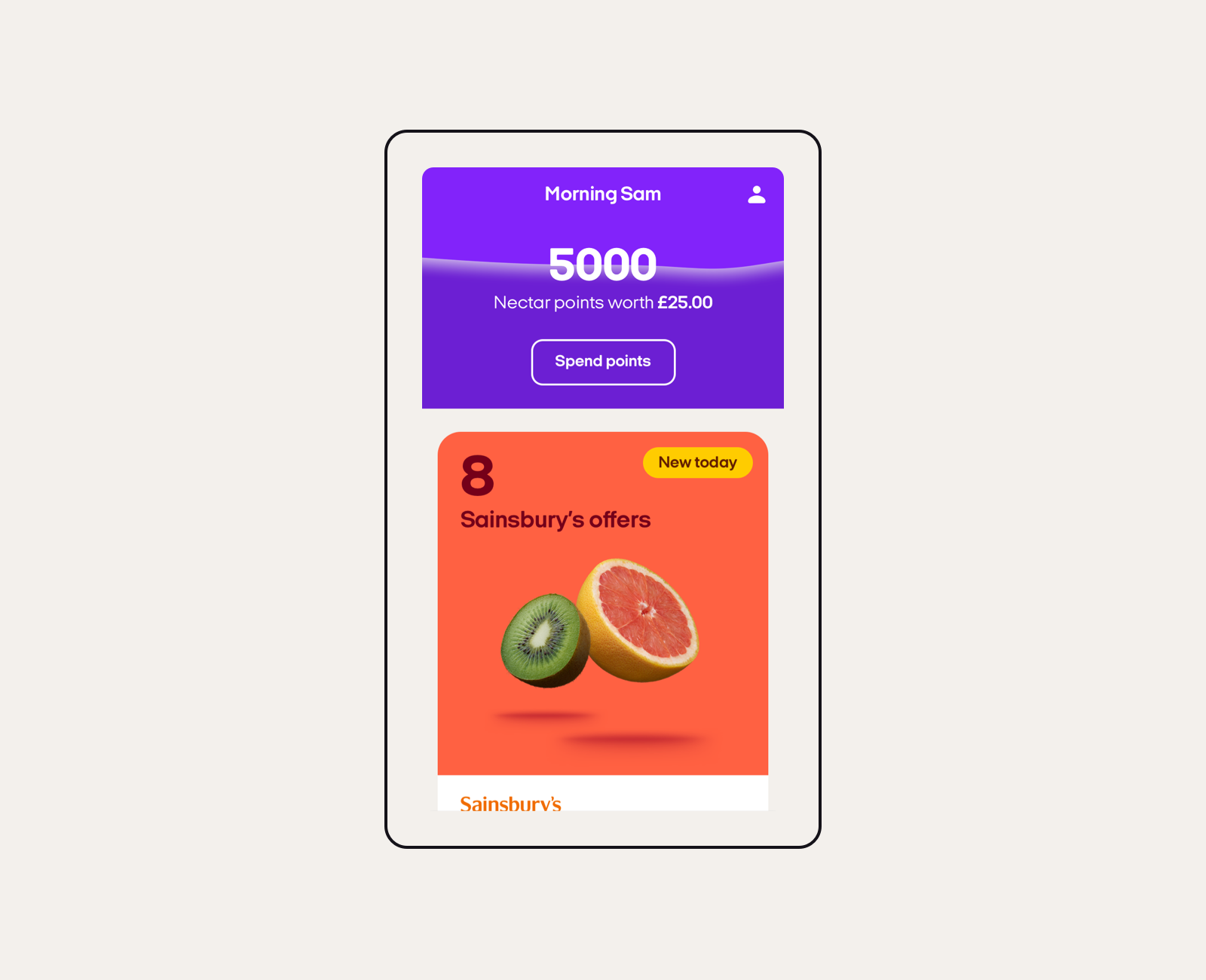
The heart of the app — home to our most used feature (the Nectar balance), account features and offers.
The Nectar points balance (updated in real time for Sainsbury's purchases) is the primary feature customers told us they wanted. Simple but effective. Our distinctive wave animation washes up the screen every time the app is opened or when the balance changes.
We designed a system of big cards (we call them pods) that provide access to offers and content. They really make the most of our primary palette, oversized typography and distinctive floating imagery.
Dynamic labels can be added to the top right of pods via the CMS to provide additional messaging to customers.
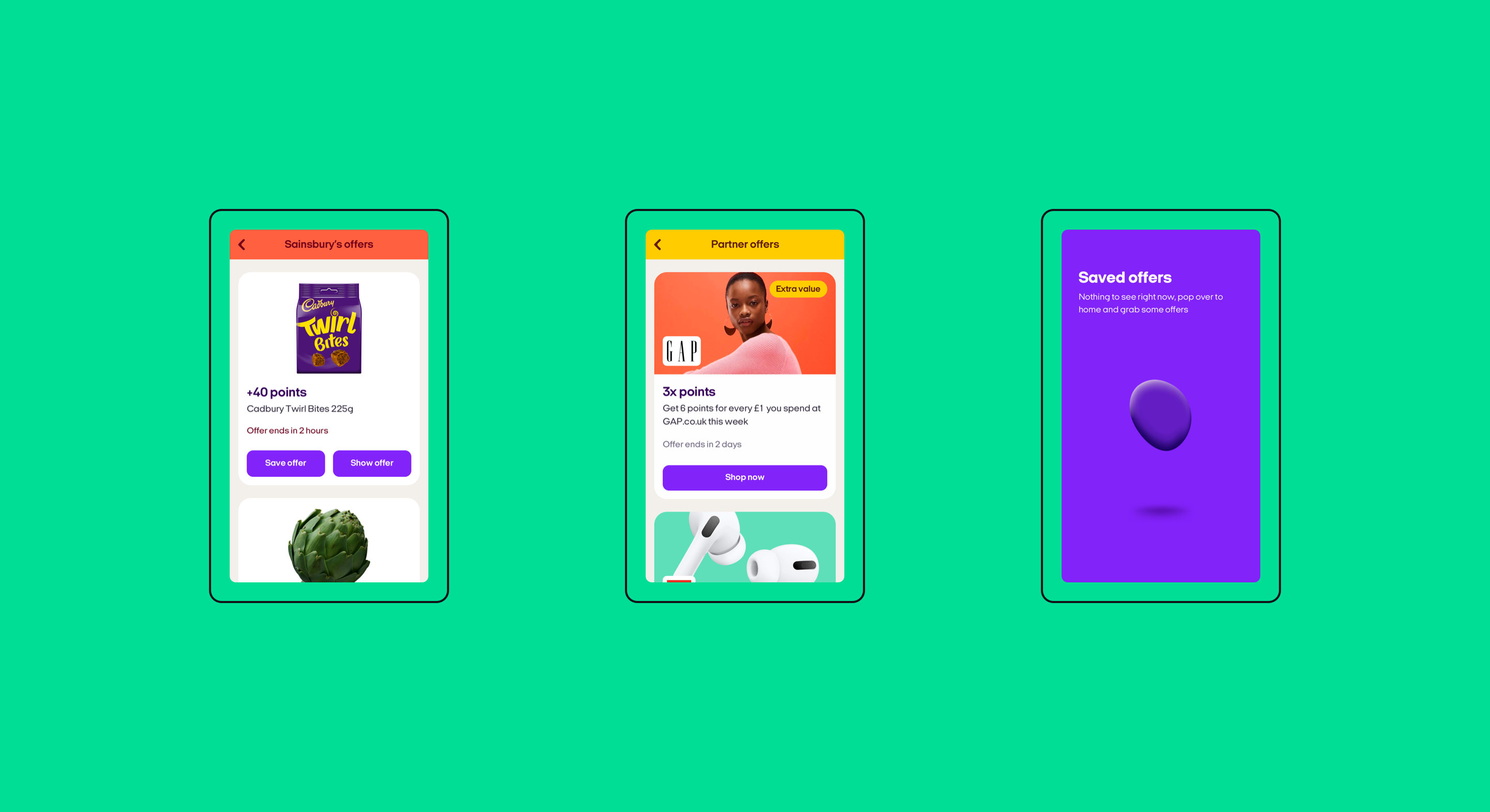
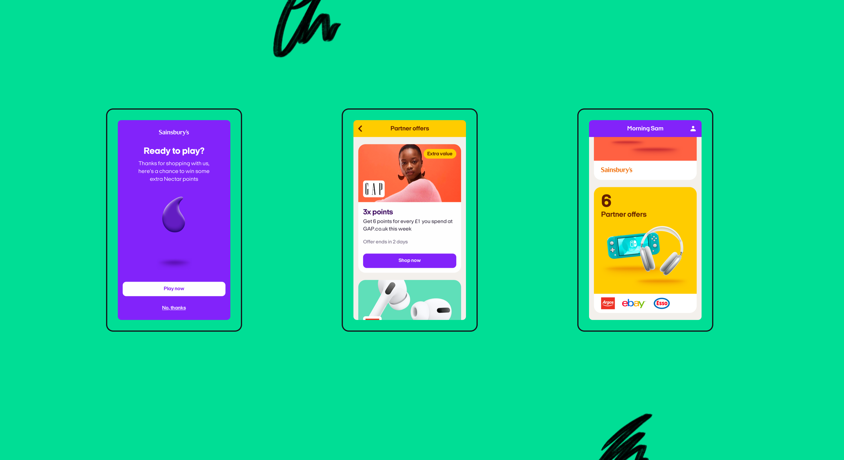
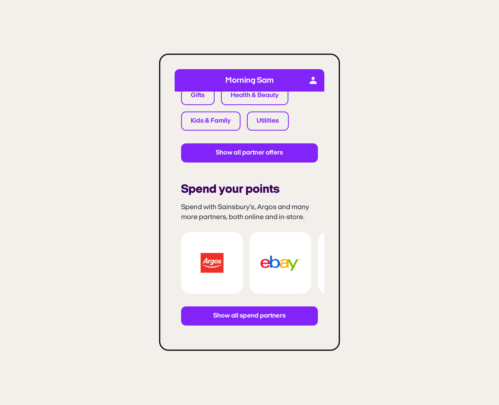
Offers
The Nectar app is packed full of offers from Sainsbury's, Argos, eBay, Esso and 300+ big brand partners. They change every week.
We designed our offer cards to be big and bold — showcasing colourful brand imagery. For partner offers, labels can be added via the CMS to draw attention to statements such as 'New' or 'Extra value'. We've found labels to be highly effective at gently influencing customer behaviour.
Sainsbury's offers are highly personalised and can either be saved or left to expire. Once saved, offers move to a specific saved area. We decided to change the design of saved offer cards to ensure a clear differentiation when a customer flicks through the app at pace.
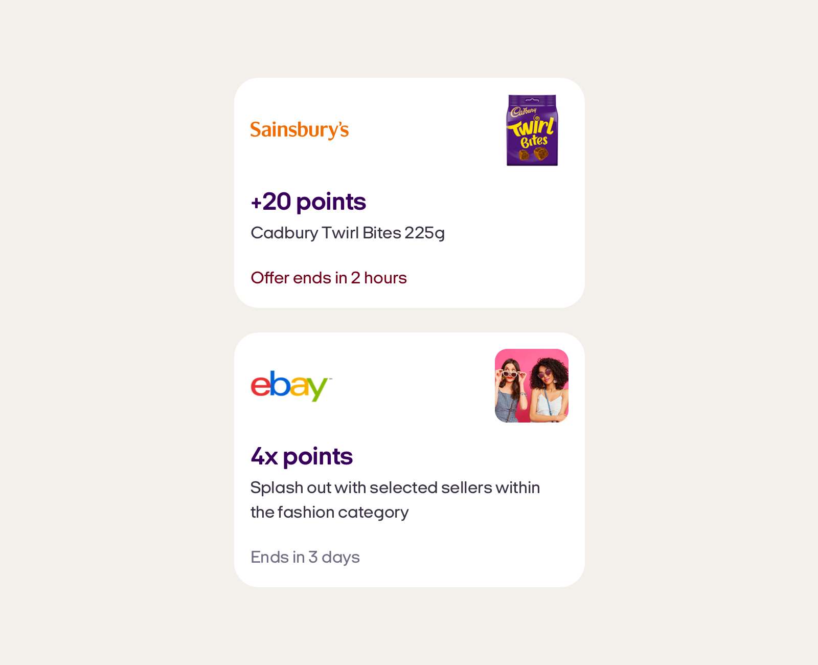
Saved offer cards
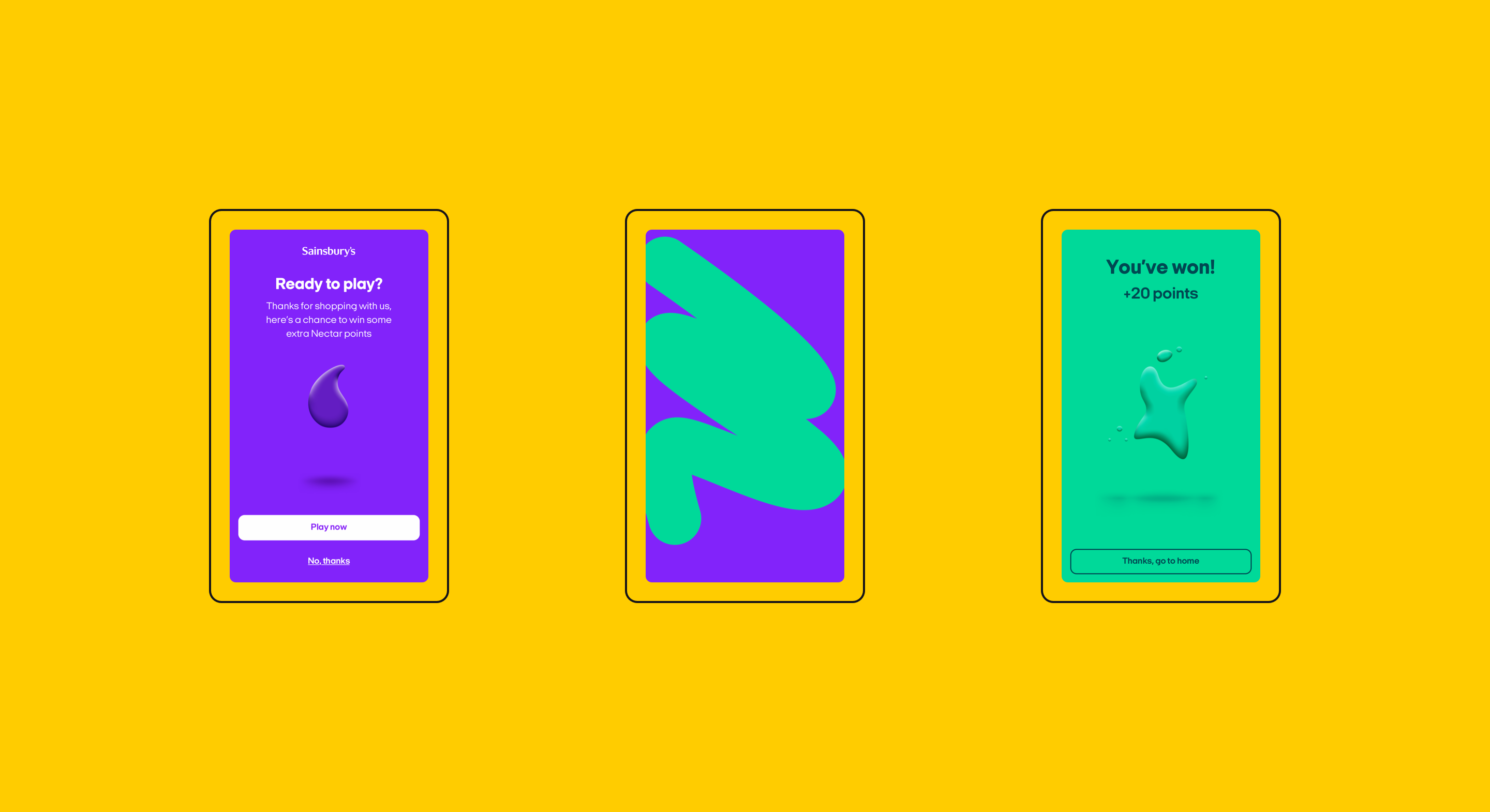
Swipe to win
We designed this feature so that we could surprise and delight Sainsbury's shoppers after their shop (qualifying transactions only).
A simple swipe of the screen reveals an animated expression and the number of points, which are automatically added to the customers' balance once they tap on the 'Thanks, go to home' button.
We're able to control the alogrithm to adjust the points range and propensity to win throughout the year.
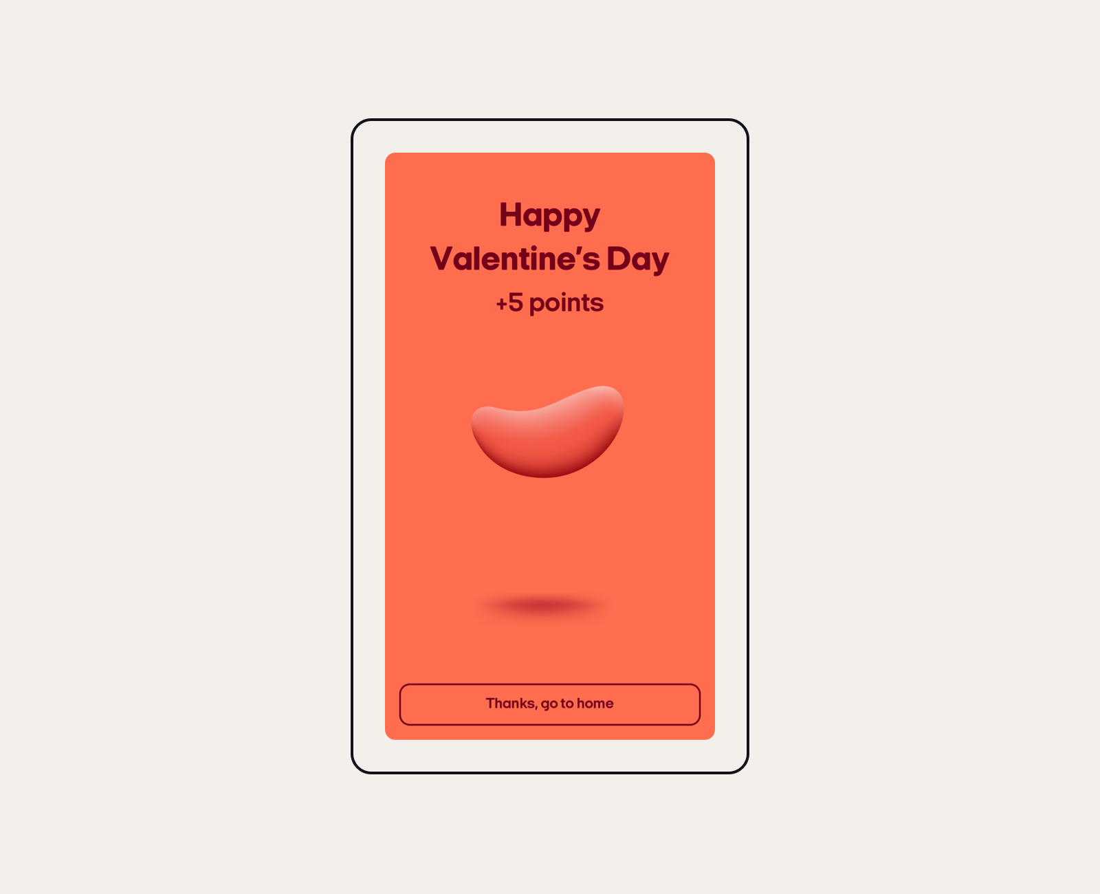
Seasonal variations add surprise and delight
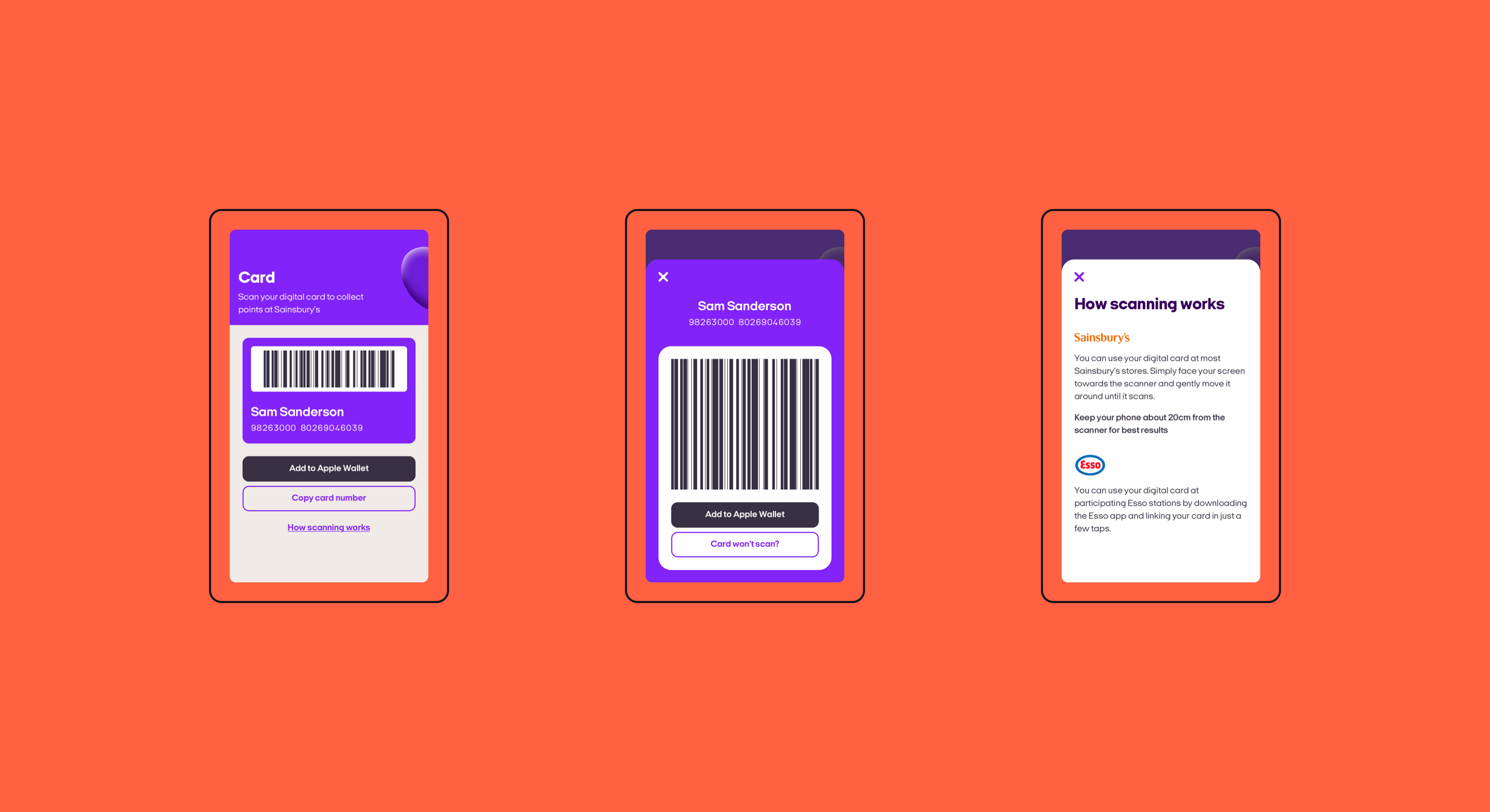
Digital card
We launched the Nectar app with a digital card that could be use in Sainsbury's stores — this was never possible with the previous Nectar app.
Our procurement and technology teams worked around the clock to install scanners in stores across the UK in time for launch.
The distinctive 'curious' Nectar expression is present at the top of the page — peeking in and out. This gives a bit of character to an otherwise very functional page.
2019 enhancements
After significant customer requests and months of persuading our technical tills team to get some changes onto their busy roadmap — we launched Apple Wallet (and Google Pay) functionality.
In the summer Esso joined Nectar as a partner too. Whilst the ideal scenario would have been to allow customers to use the Nectar app at service stations — technical limitations meant this wasn't possible. Customers are therefore prompted to download the Esso app where they can add their Nectar card in a few taps.
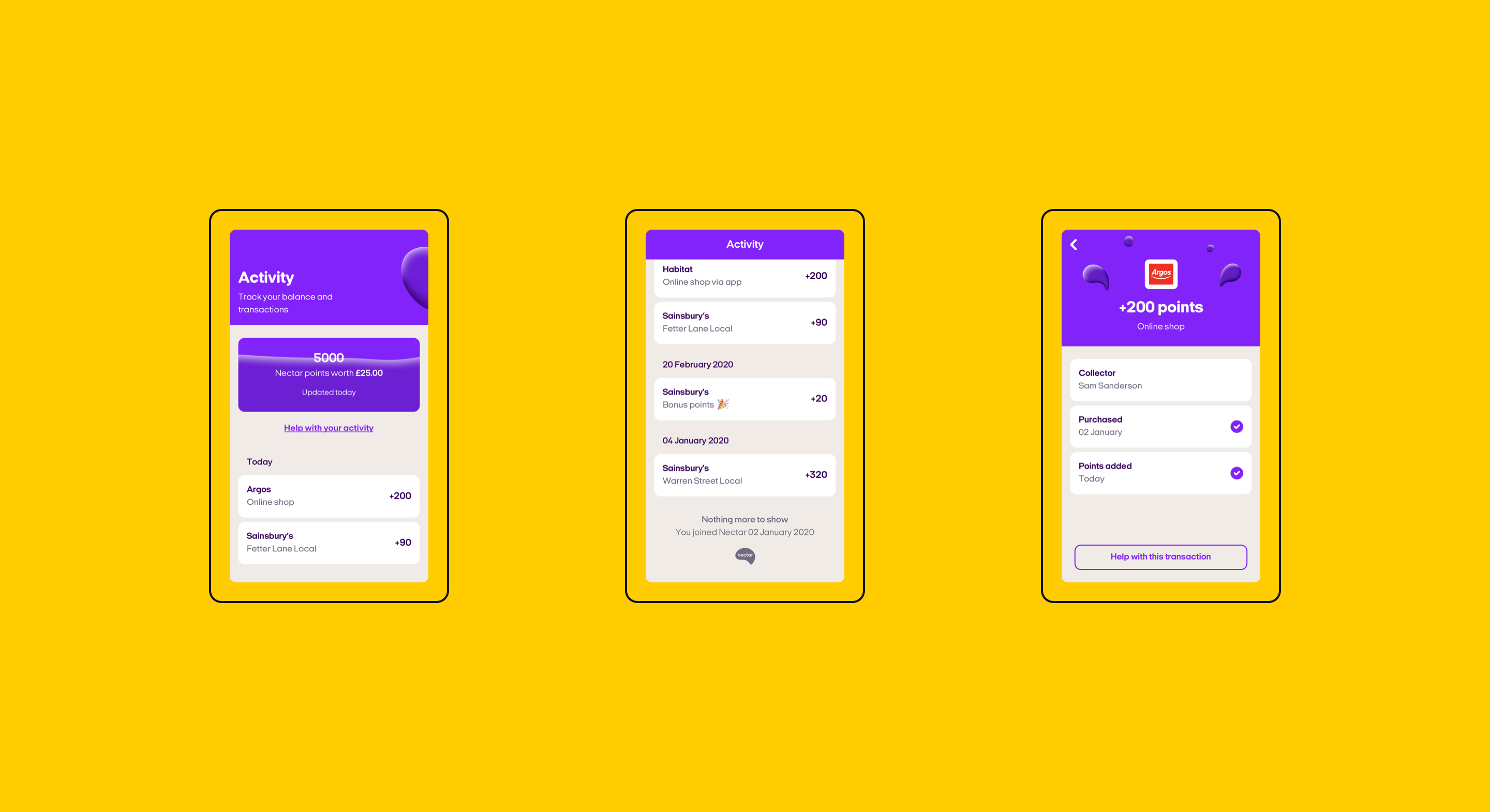
Activity
Activity is at the core of the Nectar app allowing customers to see their transactions from Sainsbury's and our 300+ big brand partners.
Whenever a customer collects bonus points (we give these away with our swipe and win game), we call the transaction out separately — this keeps the extra value app customers receive front of mind.
Future enhancements
We're working with our tech teams to integrate a pending points functionality. This is particularly important as points from partners can take up to 90 days to appear within the activity.
To provide a better experience for frequent Nectar shoppers we'll also add filtering and search functionality for transactions.
We organised a hackathon day back in 2020 where we focused on a potential new feature: digital receipts. Thanks to the success of the day — this feature is now on our roadmap for 2021.
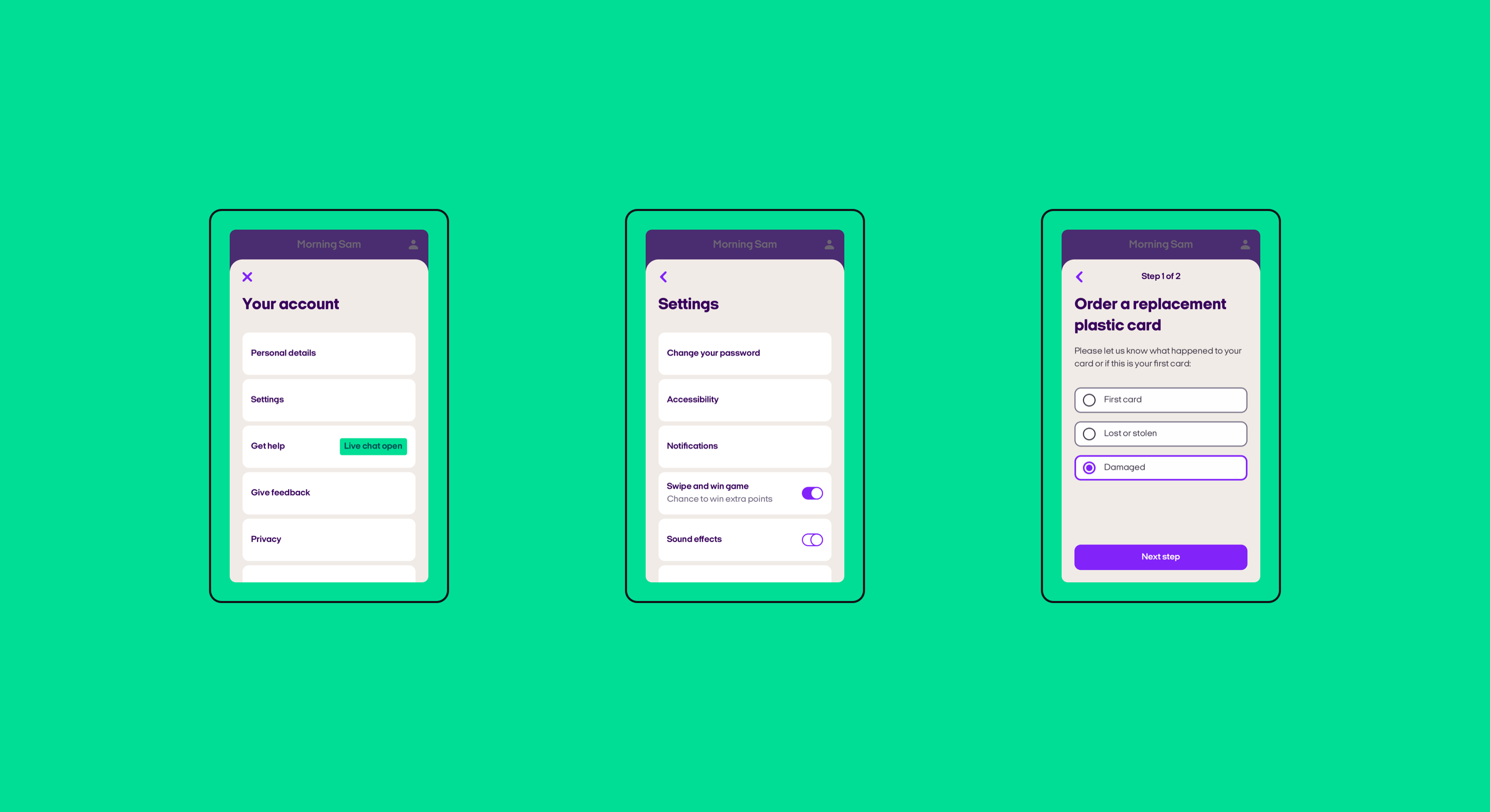
Account
Account is accessible from the home page and includes everything from help to privacy terms.
Our card based language persists throughout — keeping content clearly separated. Rounded corners help create a friendly and approachable feel.
Future enhancements
We're working on improving self-serve functionality via the Account section. Customers have asked us for things like family accounts and the ability to add points retrospectively from a reciept. This will also help us achieve key objectives around reducing CTS.
Whilst the account area will always remain resolutely functional, we're exploring ways to make pages more visual and bring key information further forward.
Design language
We established (and continue to work on) a design language that's based on the Sainsbury’s Luna design system. This includes typography, spacing, colours, iconography and key components. This is currently managed within Figma and includes extensive code support for web.
A-B testing programme
We've established a customer-focused and hypothesis-driven approach to continual improvement, that prioritises practicable changes and speed of delivery.
Drawing from various sources such as qual insight or analytics, we determine areas of the product that we can enhance without significantly impacting overall architecture or experience.
To keep the feedback loop as lean as possible, we empower designers and key stakeholders to move from ideation to release in the shortest time possible and with the least amount of internal bureaucracy.
Example — Spend
A short while after we launched, we noticed regular customer feedback across multiple channels around the lack of visibility regarding spending points.
We had always planned to include this feature as part of the initial product offering; however, we made the difficult decision to deprioritise it due to unexpected technical work.
So, we designed a spend section and positioned it at the bottom of the Home tab; when tested within a moderated lab environment, it performed well.
Whilst we saw a sharp decrease in negative sentiment we still noticed that some customers were not clear on where to find spend information, and the CTR's felt low for a tab with significant traffic and interaction higher up.
Back to the drawing board, we hypothesised that spend would be better as a quick CTA; placed contextually with balance. An additional benefit would be its newly prominent position.
Measured over three weeks' we noticed some positive customer feedback around spend visibility along with a significant uplift in our key metric:
60%
positive uplift in CTR vs. control
Outcome (so far)
The Nectar app is at the forefront of our loyalty strategy and continues to be evolved. Here are some of the highlights since launch:
87%
of customers we surveyed in 2020 were either highly satisfied or satisfied with the app
4.6
overall rating on the AppStore
200%
YOY growth in registrations
Millions
of 4 week active customers
What's next
The Nectar strategy will inform the product direction for the 2021 financial year and beyond. Whilst we are building on a successful product; the challenges ahead are ever more complex:
Highly ambitious 'four-week engaged' customer targets require intensive cross-business collaboration including key areas such as tech, data and procurement.
I'm working at director level to procure new contracts with technology providers that would allow us to better track customer journeys and increase our ability to have meaningful conversations with our customers.
We're all working closely with our data teams to improve the quality, variation and personalisation of offers — the cornerstone of the product.
In addition, COVID-19 continues to challenge known customer shopping behaviour.
Credits
Better together — these are just some of the wonderful people that make this work possible:
Design lead
Simon Collingwood
Darren Bennett (Previous contractor)
Designers
Nick Jones, Henry Dinkel, Holly Lancefield, Kristof Goossens, Rosi Holdsworth
Seb Barrymore (Previous contractor)
Principal product manager
Maeve O'Rourke
Product owners
Subika Sadiq, Cassie Madge, Saint Noel
Analytics
Subika Sadiq
Customer testing agency
Fluent Interaction
Data
Rachel Wallace, Elizabeth Harris
Engineering
In-house, various
Let's talk